Moshi
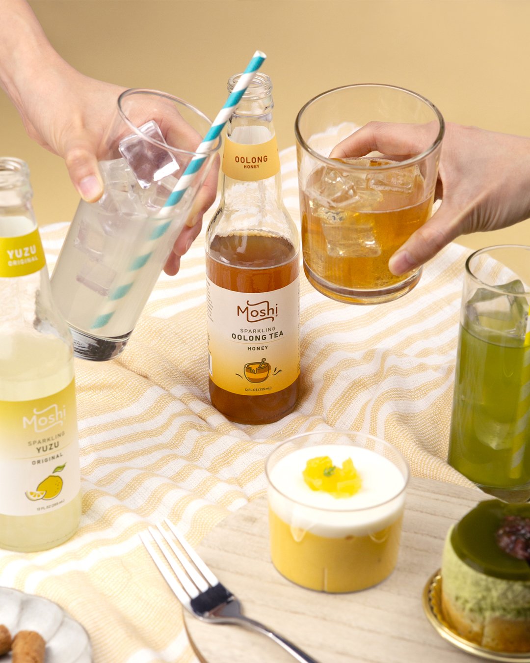
Moshi is a premium, award-winning sparkling beverage brand that features unique Asian flavors made from all-natural ingredients. Founded by a former chef, Moshi was created to provide thoughtful, high-quality beverage options that resonate with the Asian American experience.
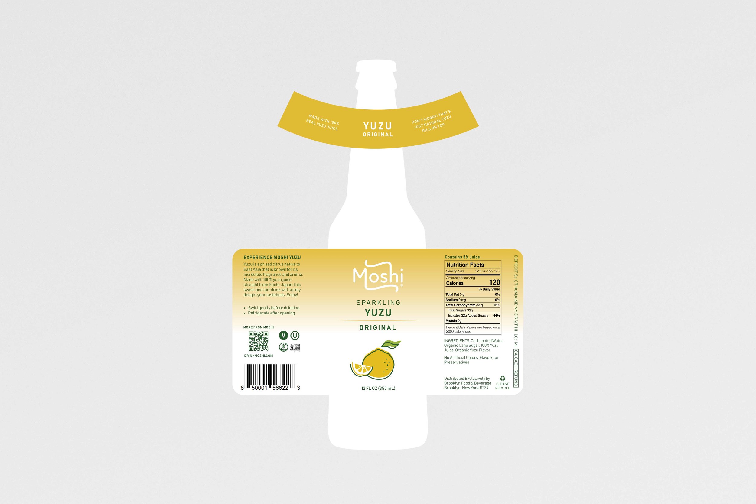
Moshi's initial products were a line of sparkling yuzu beverages. While promoting their drinks, the team noticed that some customers mistakenly interpreted yuzu, the main ingredient, as the brand's logo. Furthermore, they felt that their packaging needed an update to better attract a younger audience. The founder reached out to me for assistance with the company's rebranding efforts.
*The contents and designs of this presentation are owned solely by Moshi.
Services
Logo Design
Packaging Design
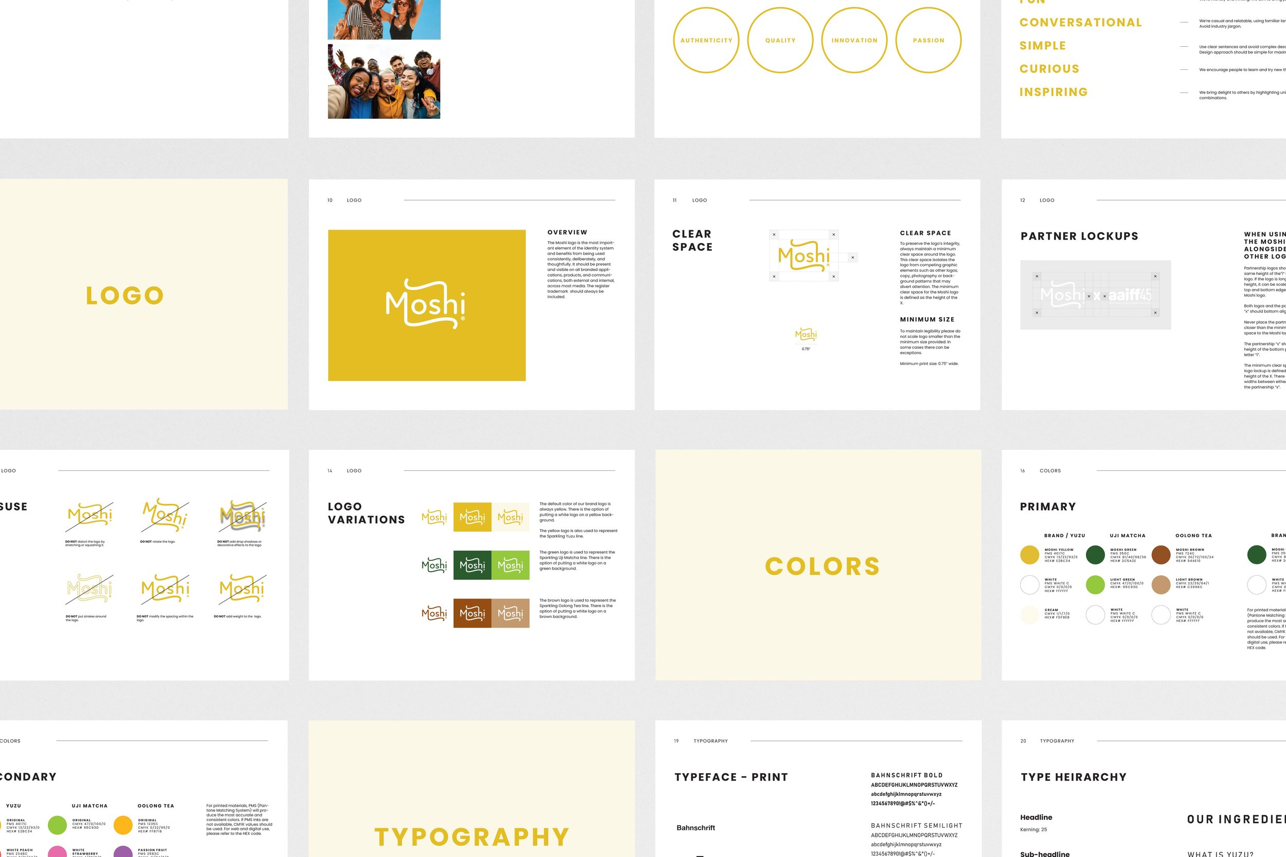
Brand Guidelines
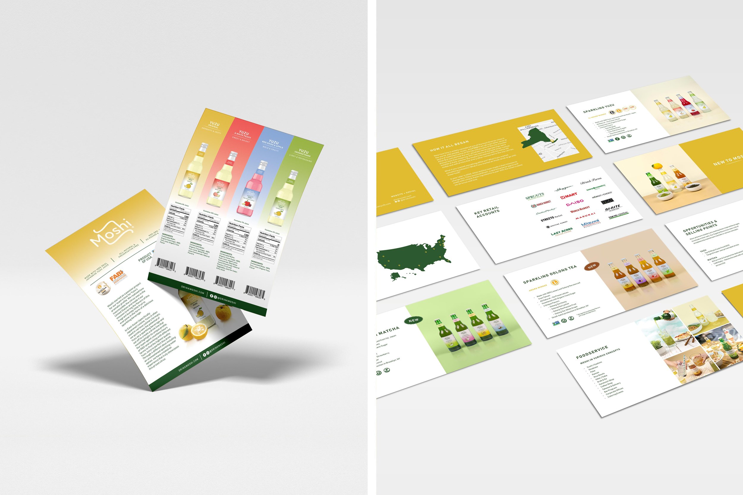
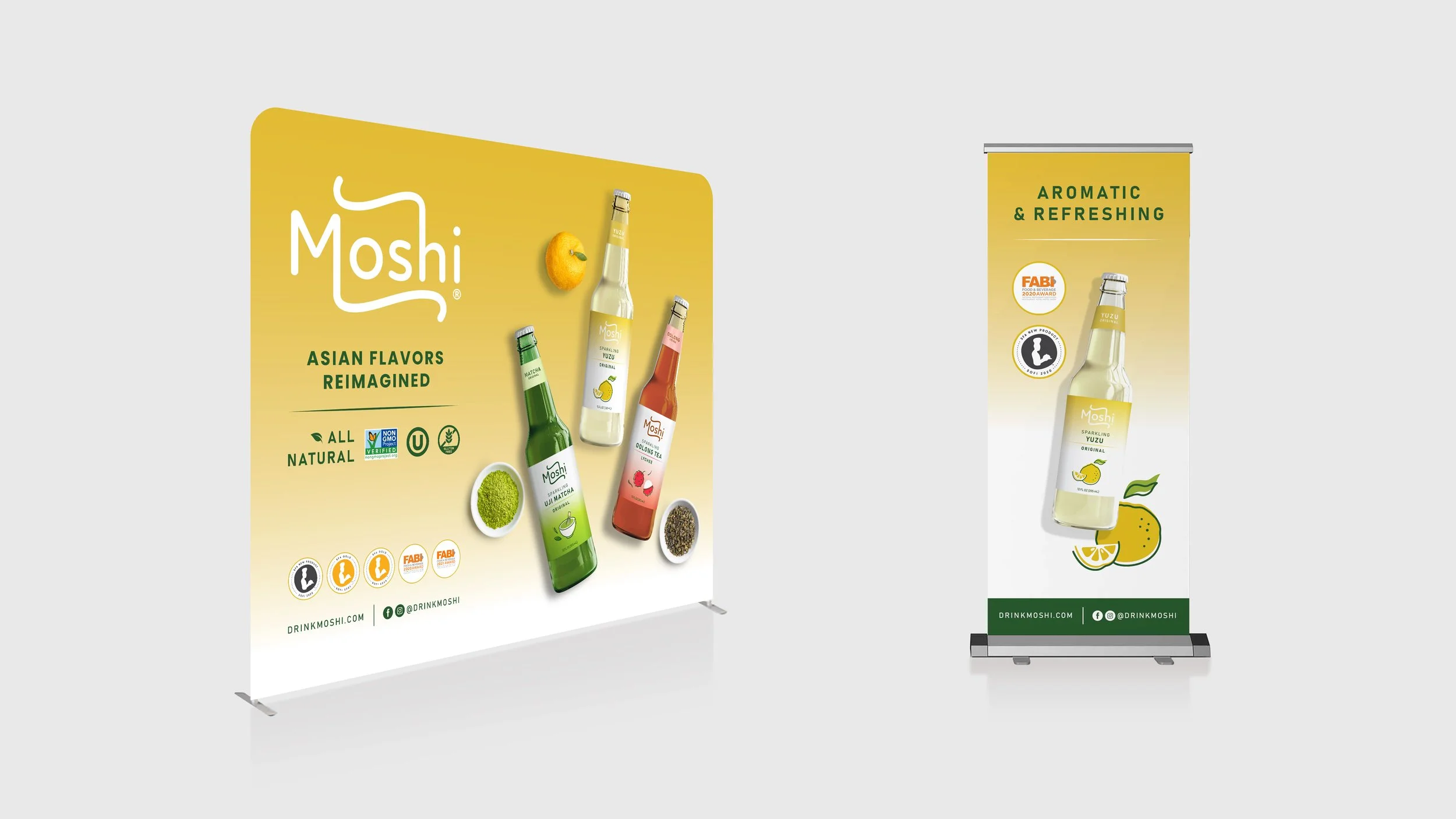
Marketing Collateral
Photography Art Direction
Shopify Website Assets
Social Media Content
Rebrand
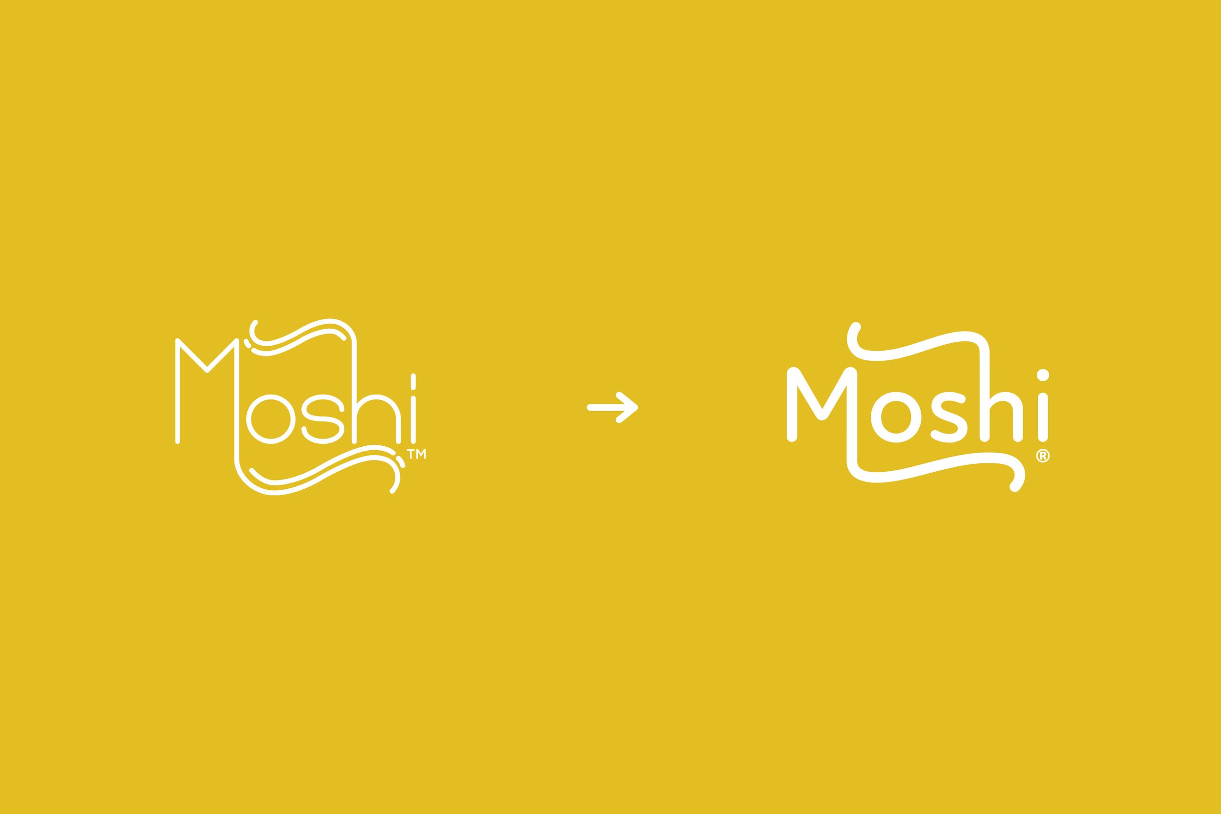
The new logo features a more rounded design, with fewer strokes and a thicker line weight. It is more recognizable and better captures the essence of Moshi as a clean, vibrant, and refreshing brand.
-
Moshi's logo was unrecognizable to their customers. The label was very busy and could benefit from a clearer hierarchy of design elements.

-
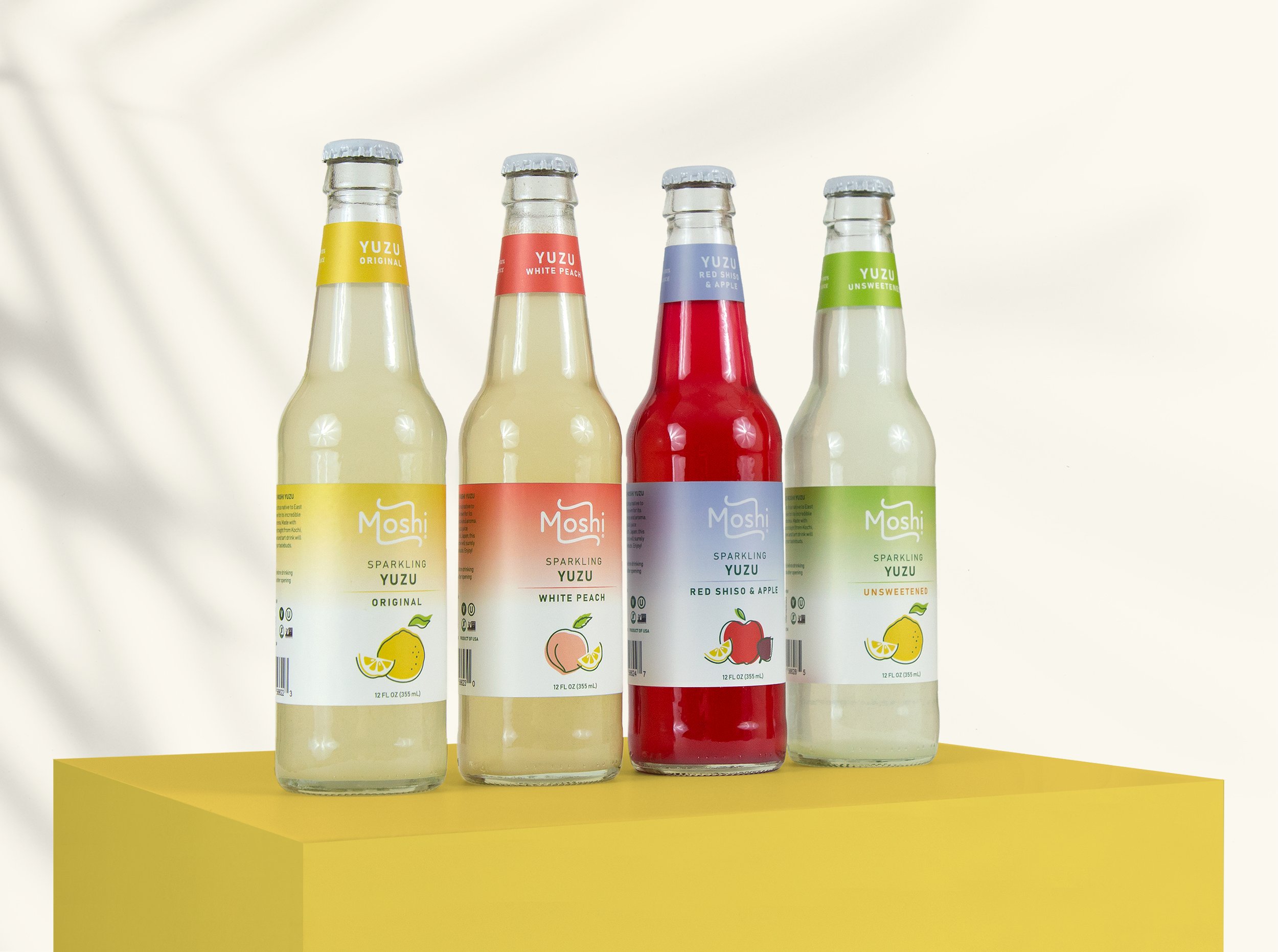
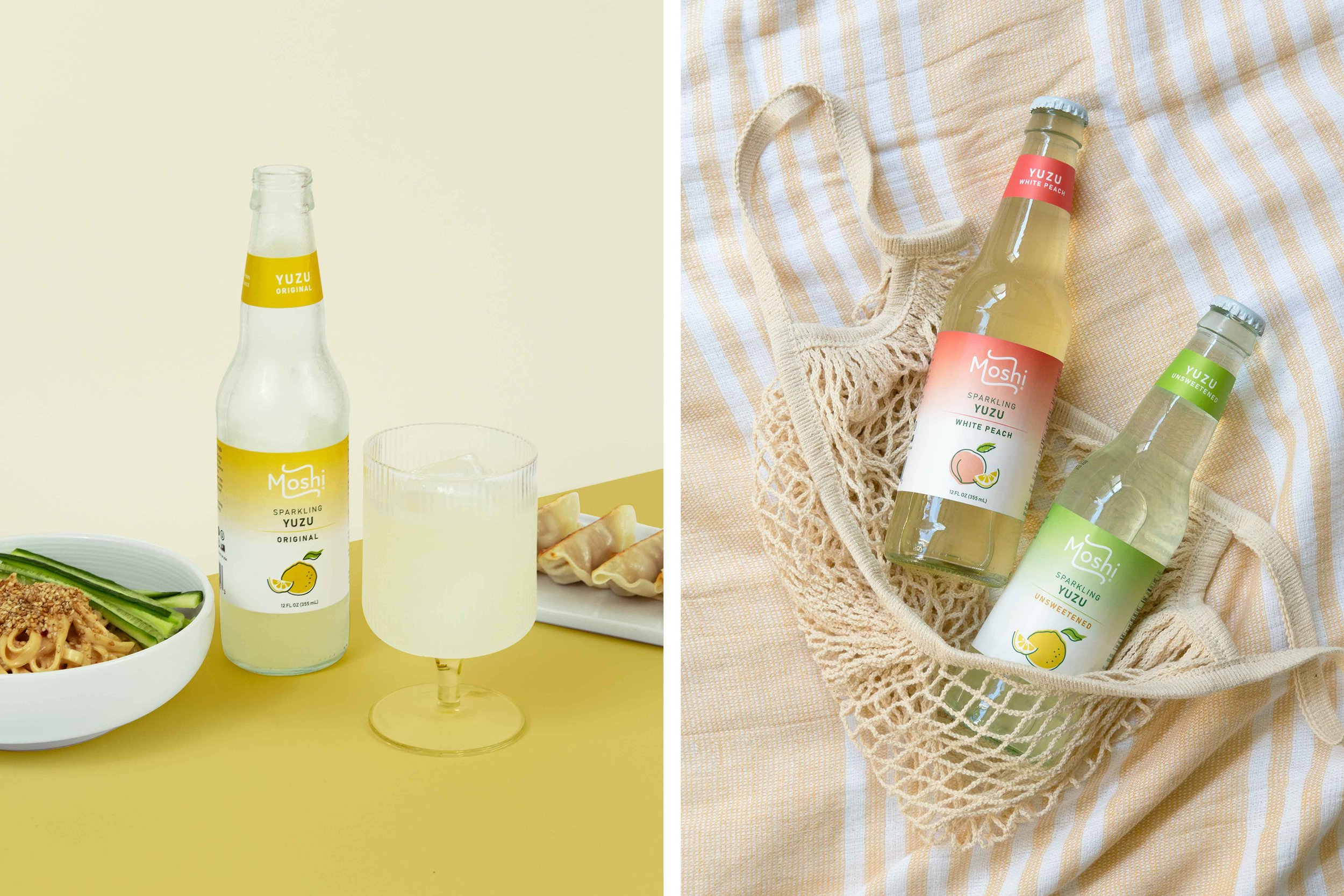
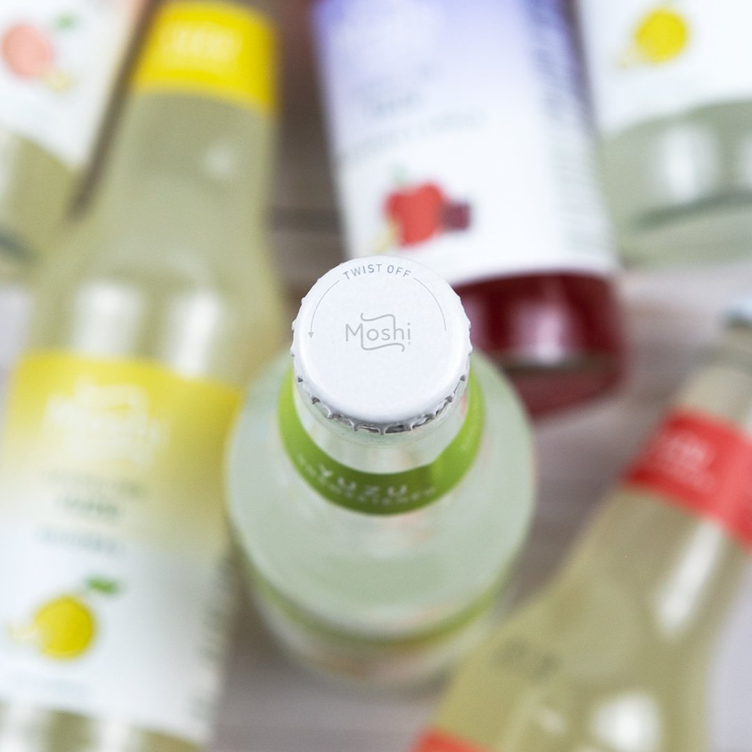
The new label features a cleaner design with fewer colors and a simple gradient background. The redesigned logo is now placed more prominently, making it easier for customers to identify. The simplified fruit graphic against the white background creates a crisp contrast. Overall, these updates enhance the bottles' visibility on store shelves. Additionally, we have replaced the bulky silver caps with sleek white twist-off caps for a more refined look.


New Product Launch
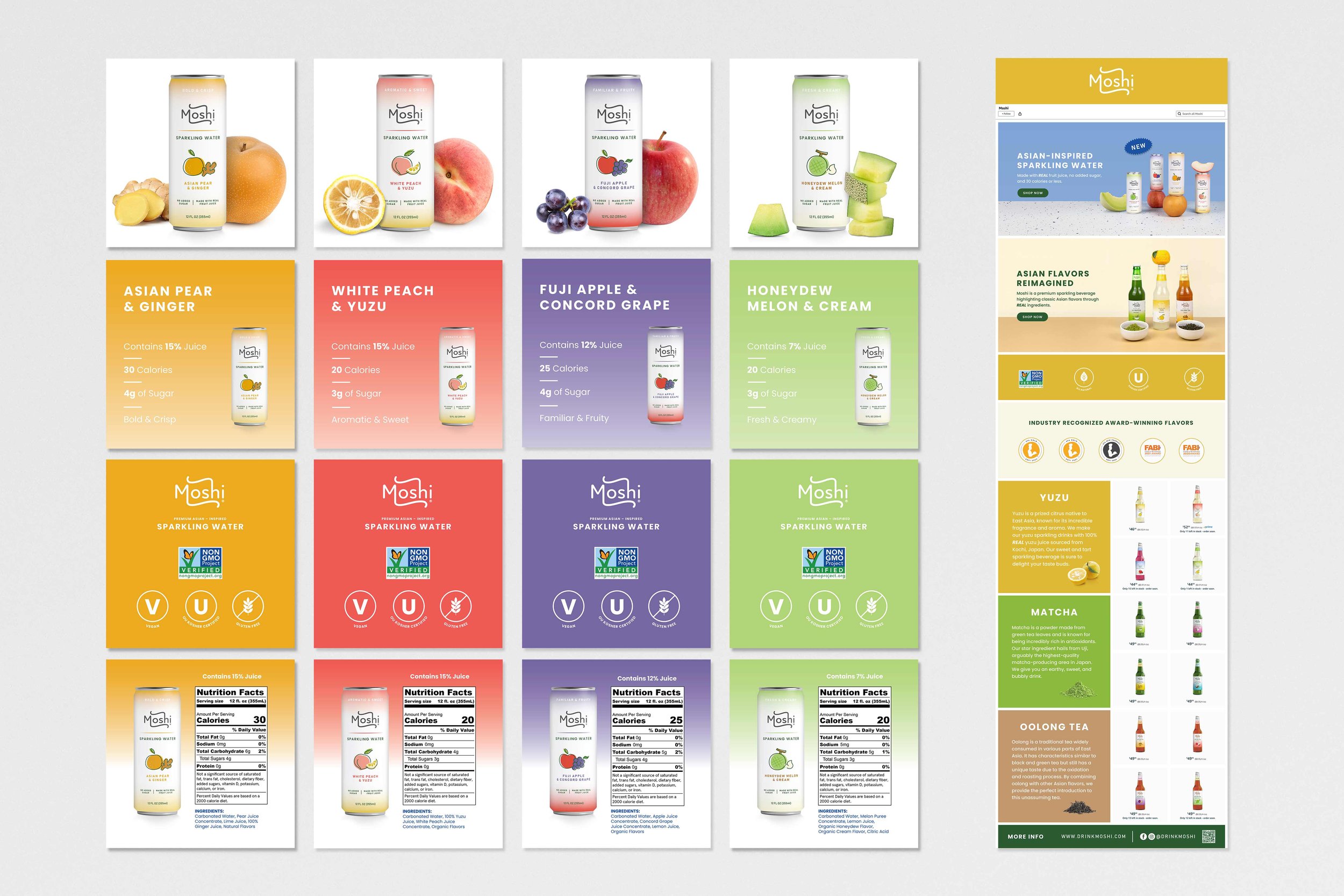
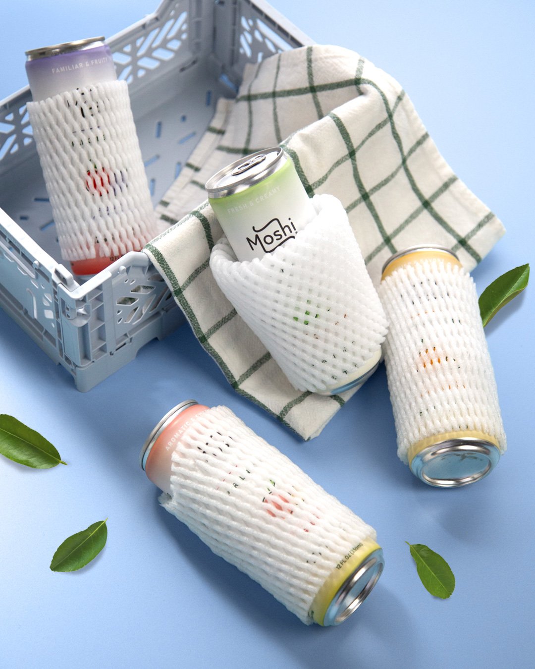
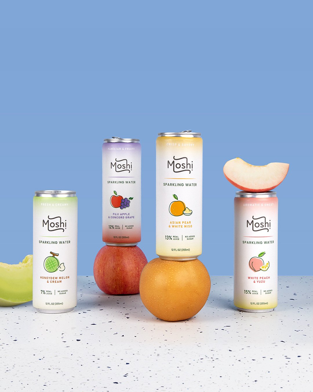
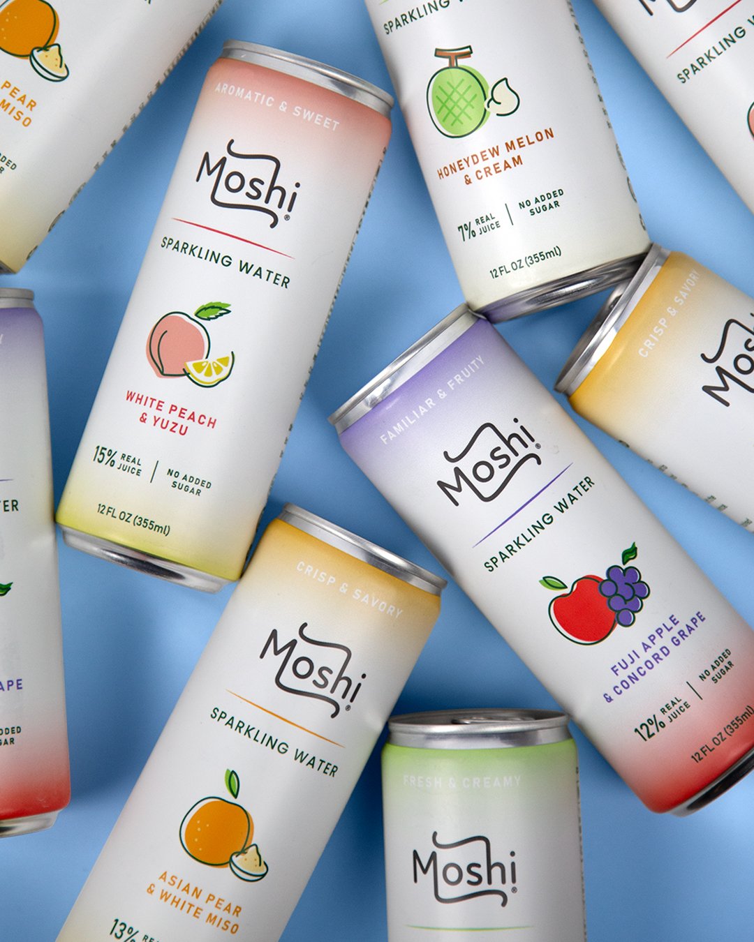
More recently, Moshi launched a line of Asian-inspired sparkling waters with real fruit juice. These are a low-sugar and low-calorie alternative to their premium craft sodas. With cans being a popular choice for sparkling waters, I designed a similar but different look for the line.
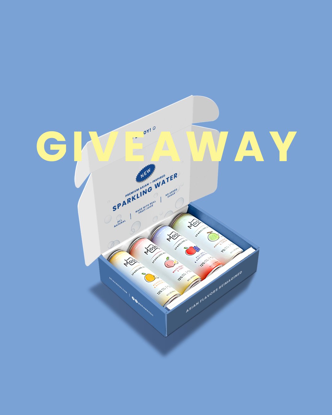
I also designed a corrugated mailer that included one of each sparkling water flavor, and vinyl stickers. In celebration of the launch, the marketing team sent them to content creators, and Moshi's Instagram followers had a few giveaway opportunities to win one.
Initially, the sparkling waters will be available for purchase through Moshi's website and Amazon store. To maximize their impact, it's essential to use high-quality images for the Amazon listings, as they not only attract customers but also increase sales. I created listing images and A+ content that will help drive engagement and conversions.